Redesigned Appian Documentation Site for improved accessibility and mobile responsiveness.
Problem Space
B2B Responsive Web Design, Design System
Tools
Figma, Google Analytics, a11y Audit, Competitive Analysis, Usability Testing, Elicitation Studies, A/B Testing, User Survey
Role
UX Designer + Researcher
Collaborators
1 Product Owner 3 Developers 1 UX Designer
Duration
5 weeks (2024), Appian Releases24.4-25.1
The Issue
"It's hard to find anything.”
-- user survey response
You are a tech-savvy product owner. Exploring workflow automation for your team, you visit Appian Documentation to evaluate Appian’s capabilities—but find it extremely difficult to navigate and overwhelming. You abandon the site, and start looking at a competitor.
You are a consultant using Appian Designer for a client’s project, and a screen-reader user. Appian Documentation should be your go-to resource to troubleshoot your project, but because it is not screen-reader friendly, you avoid visiting the site entirely.
You are an Appian developer in-training. You’ve encountered a platform error and know the solution exists somewhere in Appian Docs. You eventually find it, but only after digging through pages upon pages with interactions that feel more early-2000s than enterprise-grade.
The Opportunity
2,100+ global customers
uses Appian low-code automation platform.
144,000+ users
rely on Appian's docs site for platform guidance, solutions, and release updates.
Redesigning the site for improved navigation, accessibility, and interaction design is a major opportunity to better support both current and prospective customers, while reinforcing Appian’s position as an innovative industry leader.
The Solution
Before
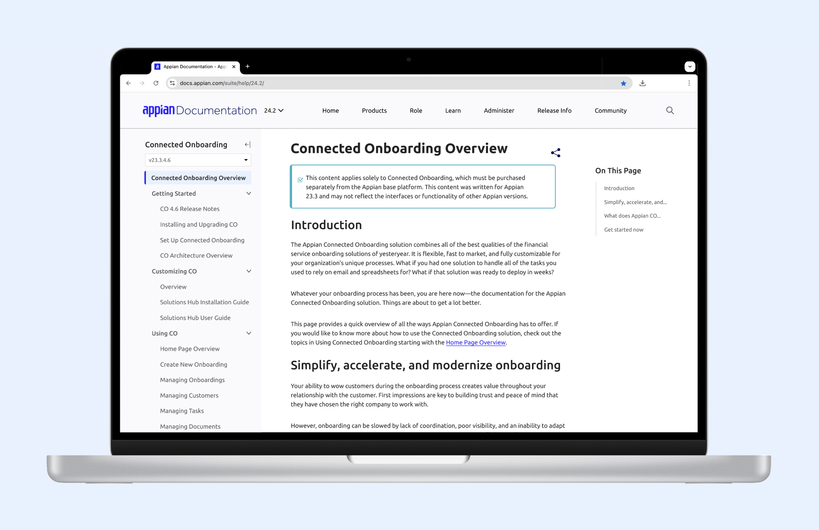
The old Appian Docs Site was last updated ~10 years ago.
After
The redesigned Appian Docs Site is powered by a unified, reusable design system that overhauls the design, behavior, and accessibility of all existing components.
Before
The old Appian Docs Site was not designed for mobile devices.
After
The redesigned Appian Docs Site is optimized for mobile, allowing users to access documentation on the go.
My Contribution
Design Impact
Co-created the design system for Appian Docs and owned the design of 10+ reusable key components.
Led UX reviews with 3 developers to ensure WCAG compliance.
Conducted 5+ user research sessions, including user survey analysis, observation studies, competitive analysis, usability testing, and A/B testing.
Business Impact
Delivered an accessible, mobile-responsive, and intuitive documentation experience that aligns with Appian’s UX strategy.
Elevated a high-visibility yet previously overlooked part of the Appian product experience.
Supported the Product Enablement Team to meet key 2024-2025 goals.
Future-proofing is essential for design systems. I involve product owners (with extensive knowledge about the Docs Site) and developers throughout the design process to ensure that we are tackling components with sustainability in mind: considering edge cases (scalability) or future scenarios where content formats evolve (reusability). I also make sure to write detailed design specs for developer hand-off and future designers' reference.
Competitors are your first prototype. I spent ~20% of my time during the redesign process conducting competitive analysis on other companies’ documentation sites and other popular sites (that definitely shape users’ expectations of a website). This is not to emulate other products, but learn from how other designers tackle similar challenges, keeping in mind their different products and user personas.
Accessibility first! Appian Docs, with infrequent revisions, has accumulated many accessibility issues: keyboard access, lack of aria labels, contrast failures, etc. To address these, I worked closely with our Accessibility Auditor and studied a11y best practices. My design process always starts with an audit of the current design, testing specifically for accessibility concerns.
Follow the user insights, not opinions, and all else will follow. Appian Docs Site users often wanted conflicting things: a docs site that simultaneously “is organized like a book, with chapters and topics” and “has all the information about a topic in one page, even if it requires scrolling to see related information” (user survey and interview data). As a designer, I interpreted these contradicting expressions into product decisions: a comprehensive navigation system with clear hierarchy and appropriate indicators of inter-page relationships.
.png)
.png)